登记册
品牌登记册。
学院印的每一样东西,从传单到证书,守同一种语域。本页把它写成文档,让身份完整地行走:标记、色码、文风,以及备好可下载的文件。
资产与下载
矢量标记、给印厂的印刷套件、给屏幕的透明 PNG。拿去;保持原样。
 字标(SVG)ORYX · 理工 · INSTITUTE,墨色字母,栗色字符。透明、矢量、可印。
 字标,反转(SVG)全部元素用象牙色,用于深底。几何完全一致,别无改动。
 徽记 / 盾徽(SVG)栗色盾徽独立。内部永不载字;不倾斜,不改色。
 徽记,反转(SVG)象牙色盾徽,用于墨色与栗色底。印刷套件(PDF)一页一资产:字标、反转、徽记、色码,纸底带出血线,直接交印厂。PNG 套装(ZIP)字标与徽记,透明底,256、512、1024 与 2048 px。
刺绣文件、招牌矢量、合署模板与可编辑的规范文档,按需提供:给办公室写信。

字标
三种文字,一组锁定。ORYX 与 INSTITUTE 用古典衬线体,墨色 #181713;理工二字(科学与工程)立在法定全名中 Polytechnic 一词的位置,栗色 #71111F。
两个字符对齐 ORYX 基线,高度与 X 的大写字高一致,与来稿图样分毫不差。字标绝不重绘、绝不重排、绝不用别的字体:本站用图样自己的矢量路径渲染它。
徽记
栗色盾徽,角形记号以白色镂空。名片背面,盾徽独立;便签上,居中于白;信封上,位于锁定组右侧。
徽记内部永不载字,永不倾斜,除栗色与反转象牙色外不做任何颜色。栗色底上,徽记用象牙色;浅底上,用白。
色彩
六个色码,取自标志图样与登记册。中间色调只从这些锚点调和;陶红永不触碰按钮或标记。
净空
字标四周各留一个 X 大写字高的边距,由虚线框标出。任何东西不得入框:字、线、别的元素的边缘都不行。
徽记同样守这条边距。拿不准就加倍;标记从不拥挤。
可以 / 不可以
六块版,各三块。错的那些是故意画错的。
可以
锁定组在纸上,墨色与栗色,安放。

可以
反转锁定组,象牙色印在栗色底上。
不可以
绝不给标记改色。陶红属于色带与图像,不属于标志。
不可以
绝不倾斜或旋转锁定组。
不可以
绝不加投影。标记永远平印。
不可以
绝不重排锁定组,或用别的字体重搭。
印刷套件
学院筹建期间印发的物件,按本站语域拍摄,一屏一件。你看到的每个标记都是真矢量,以代码叠在照片上。


标本
身份所从出的物件,一板一件,奶油与陶红底。随实物在温得和克收齐而逐件替换。
标本 · 盾徽
标本 · 河石
标本 · 羟羊角

标本 · 火漆封缄
标本 · 笔记本
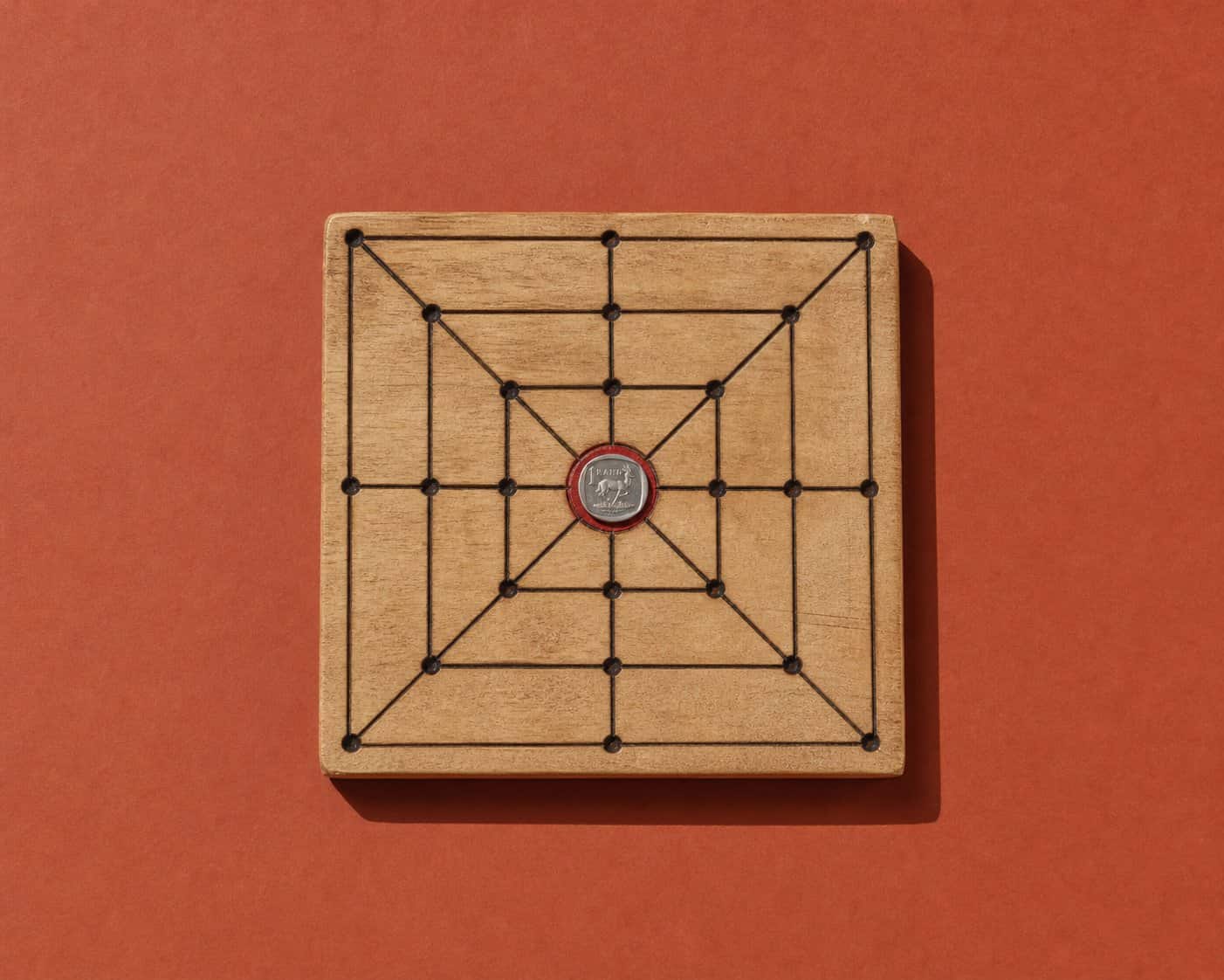
标本 · morabaraba 棋盘
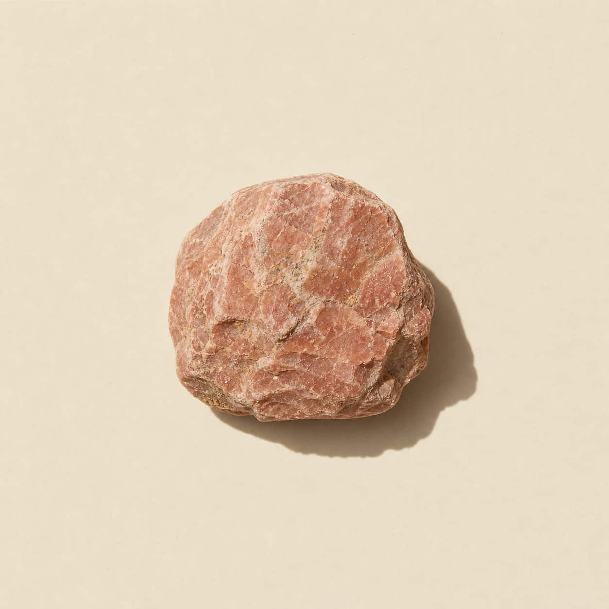
标本 · 荒漠矿物
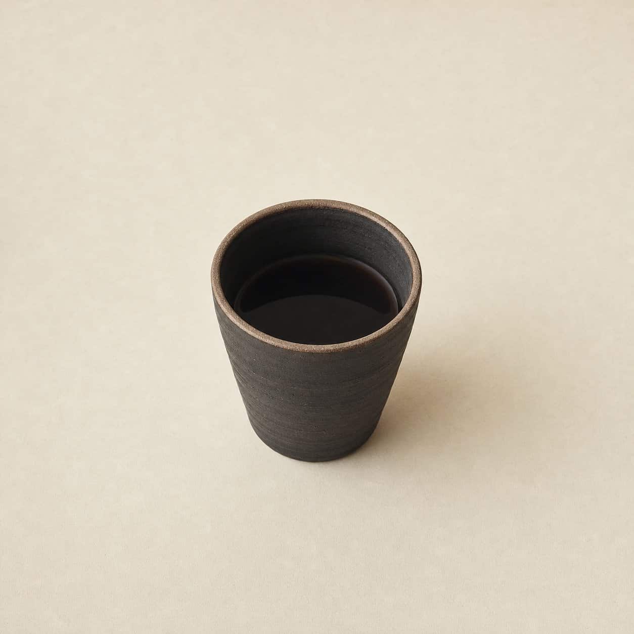
标本 · 搊瓷杯
文风,带一道横杆
陈述式,精确,不慌不忙。说出事实;注明出处;停。
- 已核准的句子逐字使用:看着无害,并不是。/ 毕业生安静地解决问题,决断地收尾。/ 以创新与实用解题见长。
- 事实要么内联注明出处,要么不发。
- 没有俏皮话,没有自我注解,图像下面没有说明。
- 状态照实说:开办前,认证前,诚实。
已核准的句子
- “看着无害。并不是。” · 招聘传单
- “Oryx 理工学院的毕业生安静地解决问题,决断地收尾。” · 招聘传单
- “以创新与实用解题见长。” · 结业证书
- “安静的活,利落的尾。” · 策略笔记
- “要决定,不要汇报图。” · 实务
- “先有证据,钱再动。” · 市场调研
- “每个数字注明出处,否则不发。” · Oryx 公报
- “没准备好的,直说。” · 登记册
- “把话说完。就到这里。” · 文风
- “安静是一种语域,不是音量。” · 文风
- “印不出来的,绝不自称。” · 品牌
英文原文 · The English original
Everything the institute prints, from the flyer to the certificate, keeps one register, and this page documents it so the identity travels intact. The wordmark carries three scripts in one lockup: ORYX and INSTITUTE in a classic serif, ink #181713, and the two characters 理工 (science and engineering) standing where Polytechnic stands in the legal name, in maroon #71111F. The characters align to the ORYX baseline and scale to the cap height of the X, exactly as the supplied artwork draws them; nothing is redrawn, restacked, or reset in another typeface.
The emblem is the shield with its horn-mark knocked through in white. It carries no text inside it, it does not tilt, and it appears in no colour but the maroon or the reverse ivory: on dark grounds it stays ivory, on light grounds white. Clearspace is one X cap-height around the lockup and the same margin around it; when in doubt, double it.
Six colour codes are sampled from the logo artwork and the register. Tints between them are mixed from these anchors only, and terracotta never touches a button or the mark. The do-and-don't plates print each rule beside its deliberate error: no recolouring, no tilting or restacking, no drop shadow, no rebuilding in another typeface.
The print kit (letterhead, business card, folder, envelope, flyer, notecard and the certificate) is photographed in the house register, one piece per screen, with every mark rendered from the real vectors in code. The vector marks, the press kit and the transparent PNGs download from this page; embroidery files, signage vectors, co-signing templates and the editable specification are available on request from the office.