The register
The brand register.
Everything the institute prints, from the flyer to the certificate, keeps one register. This page documents it so the identity travels intact: the marks, the codes, the voice, and the files, ready to download.
Assets & downloads
The marks as vector files, the press kit for printers, and the transparent PNGs for screens. Take them; keep them intact.
 Wordmark (SVG)ORYX · 理工 · INSTITUTE, ink letters with the characters in maroon. Transparent, vector, print-ready.
 Wordmark, reverse (SVG)All elements in ivory, for dark grounds. Same geometry, no other change.
 Emblem / Shield (SVG)The maroon shield alone. No text inside it, ever; no tilt, no recolour.
 Emblem, reverse (SVG)The shield in ivory, for ink and maroon grounds.Print press kit (PDF)One asset per page: wordmark, reverse, emblem, colour tokens, on paper grounds with crop marks, ready for the printer.PNG pack (ZIP)Wordmark and emblem, transparent backgrounds, at 256, 512, 1024 and 2048 px.
Embroidery files, signage vectors, co-branding templates and the editable guidelines document are issued on request: write to the office.
The wordmark
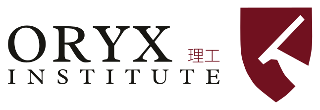
Three scripts, one lockup. ORYX and INSTITUTE set in a classic serif, ink #181713; 理工, the characters for science and engineering, stands where the word Polytechnic sits in the full legal name, in maroon #71111F.
The characters align to the ORYX baseline and scale to the cap height of the X, exactly as the supplied artwork draws them. The wordmark is never redrawn, never restacked and never set in another typeface: the site renders it from the artwork's own vector paths.
The emblem
The maroon shield, with its horn-mark knocked through in white. On the business card's reverse the shield stands alone; on the notecard it centres on white; on the envelope it sits at the right of the lockup.
The emblem never carries text inside it, never tilts, and never appears in any colour but the maroon or the reverse ivory. On maroon grounds the mark stays ivory; on light grounds it stays white.
Colour
Six codes, sampled from the logo artwork and the register. Tints between them are mixed from these anchors only, and terracotta never touches a button or the mark.
Clearspace
The wordmark keeps a margin of one X cap-height on every side, marked by the dashed frame. Nothing enters the frame: no type, no rules, no edges of other elements.
The same margin governs the emblem. When in doubt, double it; the mark is never crowded.
Do / don't
Six plates, three of each. The wrong ones are drawn wrong on purpose.
Do
The lockup on paper, ink and maroon, at rest.

Do
The reverse lockup, ivory on the maroon ground.
Don't
Never recolour the mark. Terracotta is for bands and imagery, not the logo.
Don't
Never skew or rotate the lockup.
Don't
Never add a drop shadow. The mark prints flat, always.
Don't
Never restack the lockup or rebuild it in another typeface.
The print kit
The pieces the institute publishes while it is being established, photographed in the house register, one piece per screen. Every mark you see is the real vector, set in code over the photograph.






Specimens
The objects the identity is built from, one per plate, on cream and terracotta. Replaced with real Windhoek objects as they are collected.
Specimen · the shield

Specimen · stone
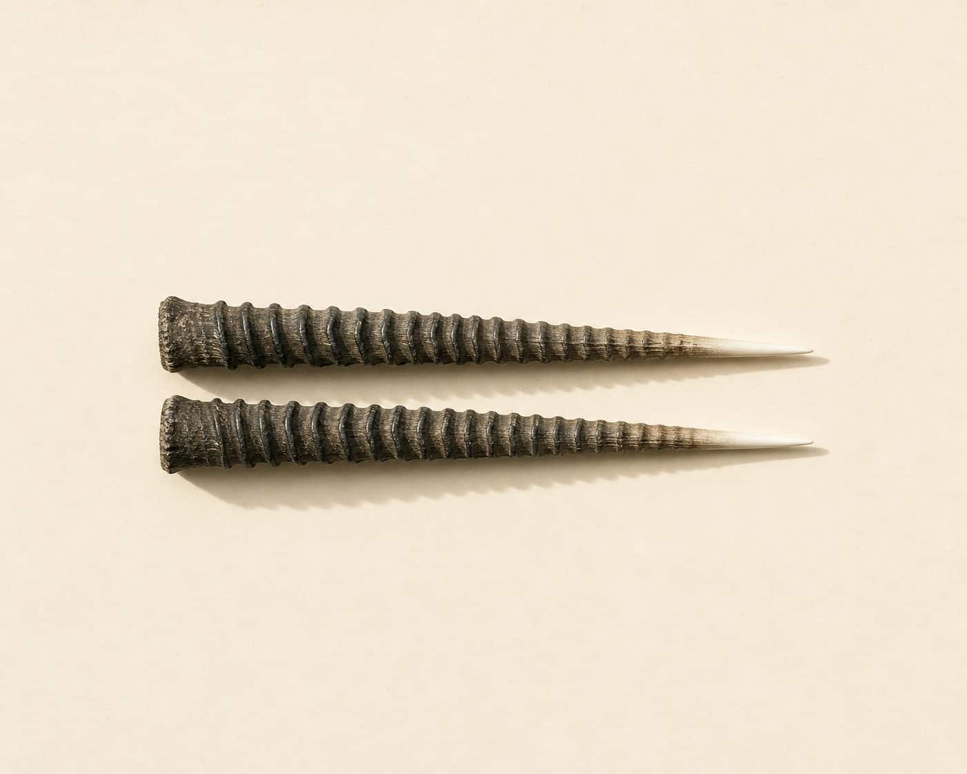
Specimen · horns

Specimen · wax seal

Specimen · notebook
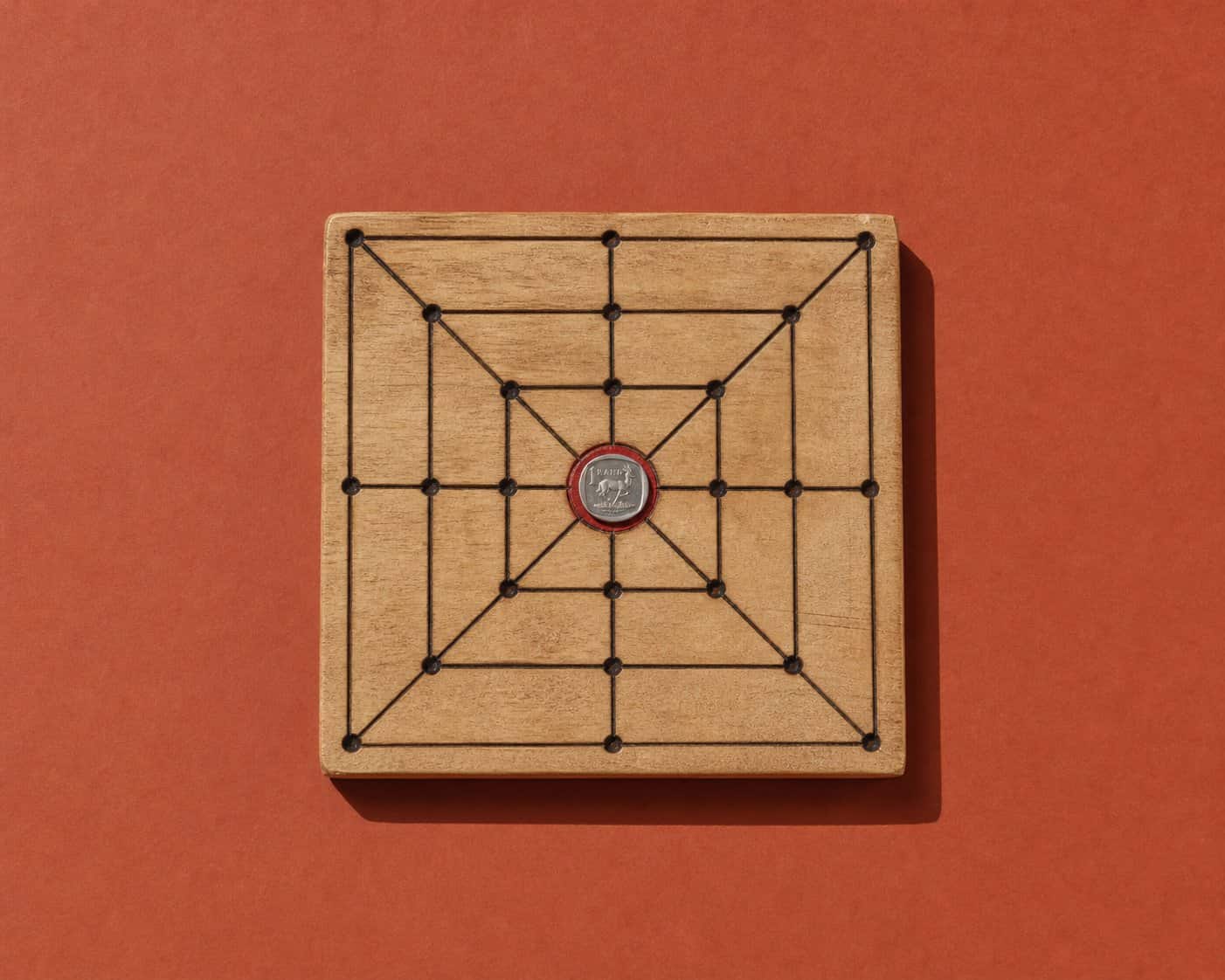
Specimen · morabaraba board
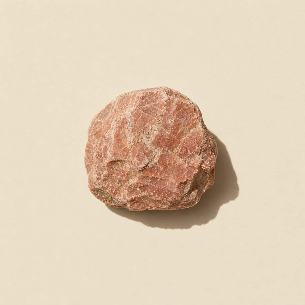
Specimen · desert mineral

Specimen · cup
The voice, with a bar
Declarative, exact, unhurried. State the fact; cite the source; stop.
- Approved lines run verbatim: Looks harmless. Isn't. / graduates solve problems quietly and finish them decisively. / excellence in innovation and applied problem-solving.
- Facts carry their source inline or they do not ship.
- No wisecracks, no self-annotation, no captions under images.
- Status is stated as it is: prelaunch, pre-accreditation, honest.
Approved lines
- “Looks harmless. Isn't.” · Recruitment flyer
- “Oryx Institute graduates solve problems quietly and finish them decisively.” · Recruitment flyer
- “Excellence in innovation and applied problem-solving.” · Certificate of Attendance
- “Quiet work, decisive finishes.” · Strategy notes
- “Decisions, not decks.” · The practice
- “Evidence before money moves.” · Market R&D
- “Every figure carries its source, or it does not ship.” · The Bulletin
- “What is not ready, says so.” · The register
- “Say the thing. Stop.” · The voice
- “Quiet is a register, not a volume.” · The voice
- “Never claim what the print kit does not print.” · The brand